Monday, January 25, 2010


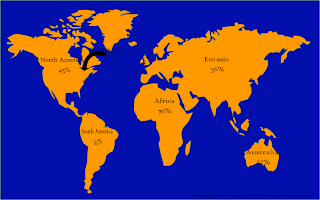
This poster is for a program at the school, called LCI's Student Nutrition Program. The main idea I had for this poster was to introduce the global poverty statistics versus the poverty of Mimico, New Toronto, And Longbranch. [Lakeshore Area]. The globe is a vector tracing of a map. I had to do several re-do's of the map because I'm such a perfectionist. I'm not 100% happy with the finished product, but happier with this than the previous attempts. The colour scheme was chosen to go with the other posters that were done besides this one, as the assignment called for a strand of 3. I do admit the percentages and contenent names are very non descriptive, I could have added more, but it was just such a long project, that I had enough. The inteded message of this poster is "Yes, there is a whole world of problems, but lets start in our own backyard first." It's not my BEST work, but I do consider it good.
Friday, October 23, 2009

Typography - Self Portrait

This was one of my favourite assignments so far. I'm extremely happy with the finished product. The whole thing was difficult, but I had the most troupble with the hair. The gap inbetween my hair, and slice bothers me just a bit, but there wasn't much I could do to fix it. The mouth isn't as good as I'd imagined it. It saddens me that I can't see my gap. [Haha] I think now that I should have done my shoulders or something or just my neck, again, can't cry over spilled milk. NEW PROJECT COMMING SOON!

Tuesday, October 13, 2009

Principles of Design


Elements done by Madea and CameraTricks
Principles done by RadioActive and Strawberryxoxo


Tuesday, September 22, 2009

Objects Assignment ~ Chef's Knife [In Colour!]


For all 5 coloured pieces, I just copied each of the original, and used the fill tool. On the sepia freehand [top] I just fooled around with various shades of brown. I regret not doing the outlines in the same shade, but you can't cry over spilled milk. I was aiming for and 'eco-friendly' approach for the "Green Blade" [middle] I used a solid yellow, and again, fooled around with the different shades of yellow-green, and then using a solid green on the blade. The Plum Knife [bottom] is one of my favourites, since purple is my favourite colours. My recently bought plum purple converes had inspired most of the colourings on it.


I was getting a little tired of black and white, but enjoyed old photos so for the sepia trace [2nd top] I fooled around with the same-ish shades of brown, as the freehand sepia knife. I had realized by this picture that I could colour the outlines, so it did look cartooney, but not TOO cartooney. It would have been nice to get it to look realistic. On the Reverse Original [2nd middle] I didn't do the colouring. The credit has to go to Adobe Illustrator. I used the fill called steel cylinder. I really like how it turned out on the blade. I wanted it to be lighter, but I couldnt figure it out. For most of the other fillings [if not all] I just filled them in with black.

Object Assignment ~ Chef's Knife


I tried my hardest to replicate the knife. Both in the tracing, and the freehand drawing. The thing is, with the freehand, I wanted it to be a little more abstract but also looking quite comparable. I am really happy with how it turned out. It took a while, and many trial and error processes, but the finished product came out better than I had expected.

The trace came out amazingly. I am especially happy with the little details on the blade, and the shadows. That came out much better than I would have thought. The tip of it reminds me of a blimp, which I'm not too happy about, but what can you do?

For both remakes, I used the pen tool. On the freehand, I used the pen tool to make the outline and the little details. The handle, I used the fill tool, and just used black. On the traced version, I started with an entire outline of the knife-which wasn't easy- and then filled in the blade, on a second layer. on the third layer, I did all the details, which include the logos, numbers, and the steel shadows. Doing the details were just SO fun... On the last layer, I did a shadow of the blade, not too noticable but noticable enough. For both the shadow, and the blade, I had just used the fill tool, agian with black.

Monday, September 14, 2009